Zemory - Image Organization Application
Zemory provides a one-spot platform for parents to connect various physical and cloud storage devices containing to one dashboard, reducing the need to open multiple files and folders while searching for their childrens' photos. It also includes an editor to that can be used to create projects and arrange photos creatively in a slideshow, which is easily sharable with family and friends!
The Problem
Parents often struggle with finding the right system to creatively organize photographs for sharing with family members, for displaying on special occasions, and most importantly, passing on to their children.
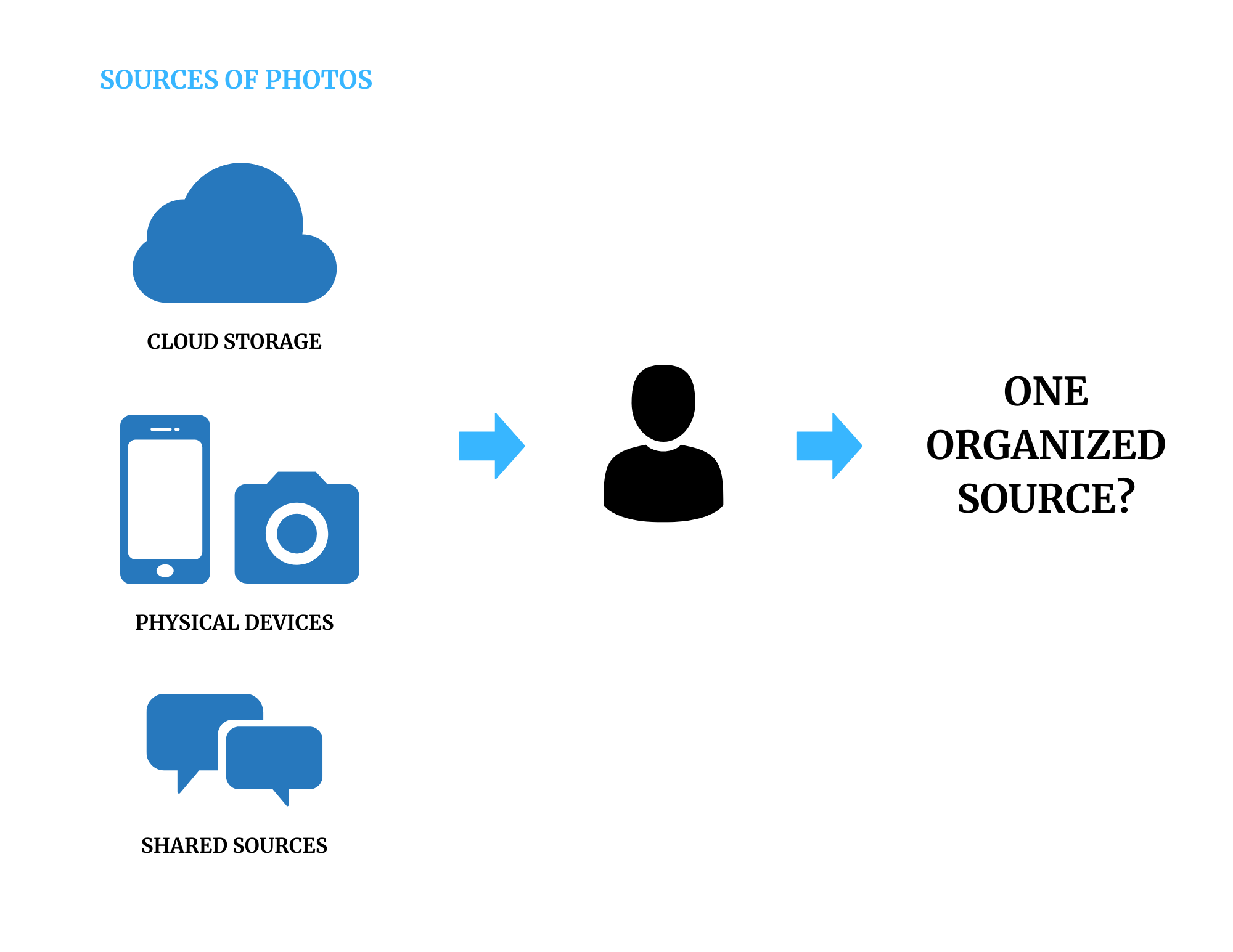
- Amy Blankson, Forbes, 2018
Why Parents?
I came across this problem as my mom spent a lot of time trying to have other family members send pictures to her and organize them in the cloud to reduce duplicates, sort them by events, etc. But to strengthen my understanding of the problem, I conducted 4 user interviews with parents and found out that:
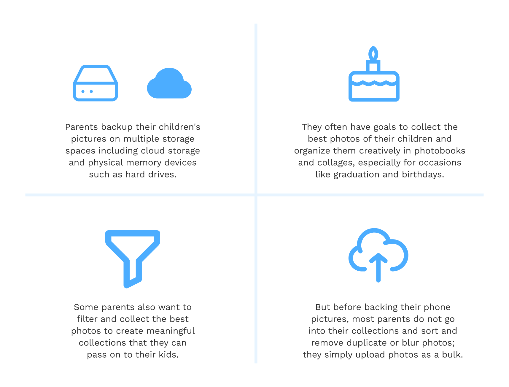
Furthermore, I narrowed down my target audience to parents of children between the ages of 0-15 as they had more creative goals for the photos they took of their children.
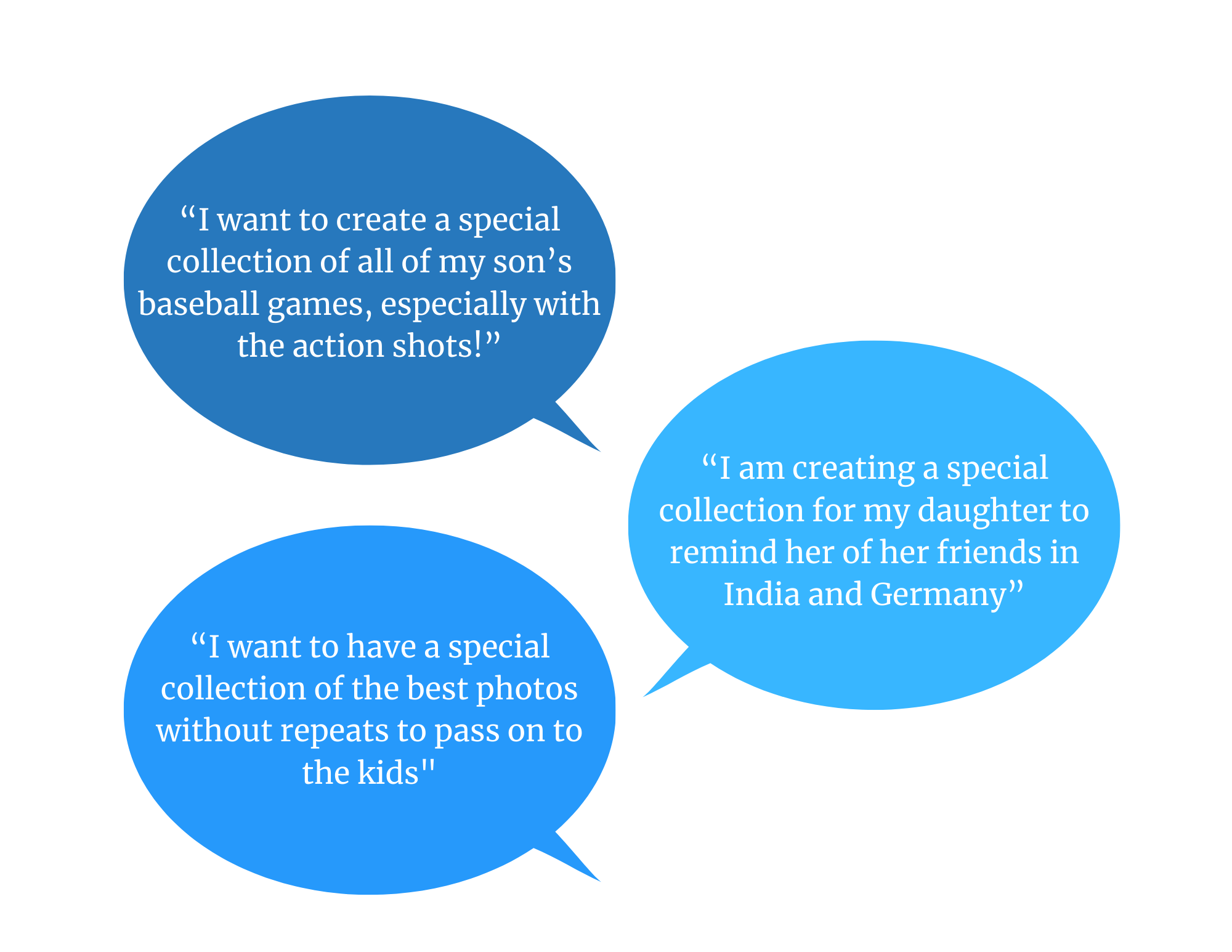
The Goal
Thus, the goal of this project was to design a solution that allows parents to organize their children’s photographs efficiently and creatively.
Brainstorming and Sketching Solutions
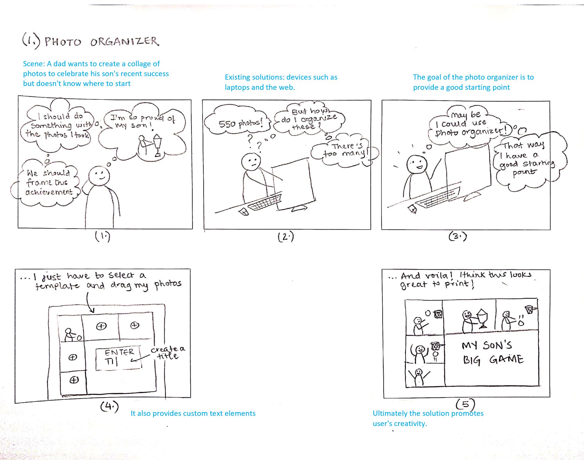
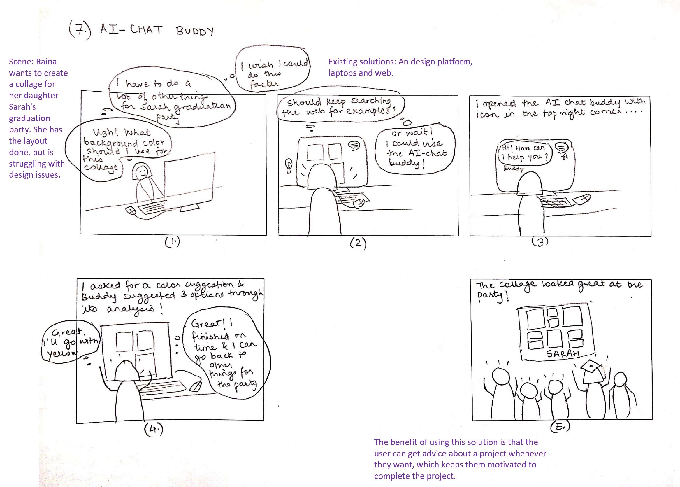
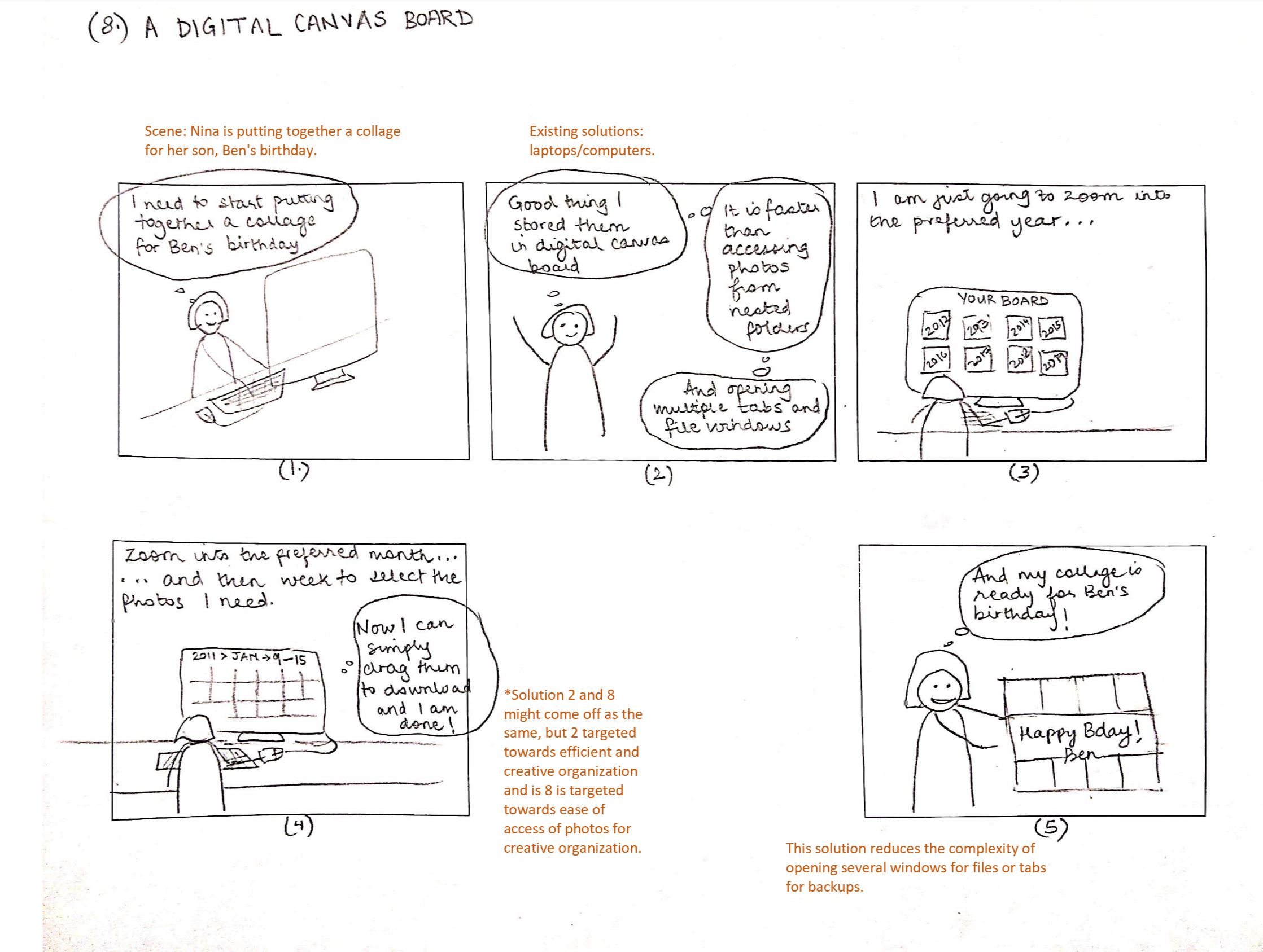
Using the above framing of the problem statement and the goal, I brainstormed and sketched 8 possible solutions for approaching the problem. These sketches allowed me to define my ideas and how they would act as a tool for the user. It was important to put the user at the forefront at this stage as it would allow me to see which of my solutions would work the best in solving the user's problem.
Evaluating the best solution using Question-Option-Criteria (QOC) Analysis
I further worked on evaluating the best out of the 8 solutions from the sketches using a QOC Analysis for the solutions that best suit the needs of the users.
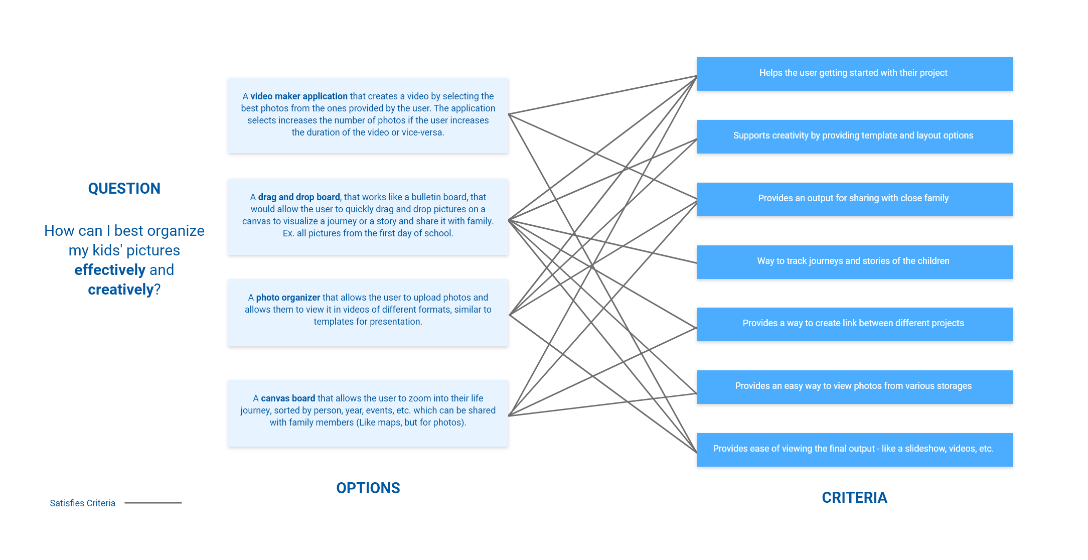
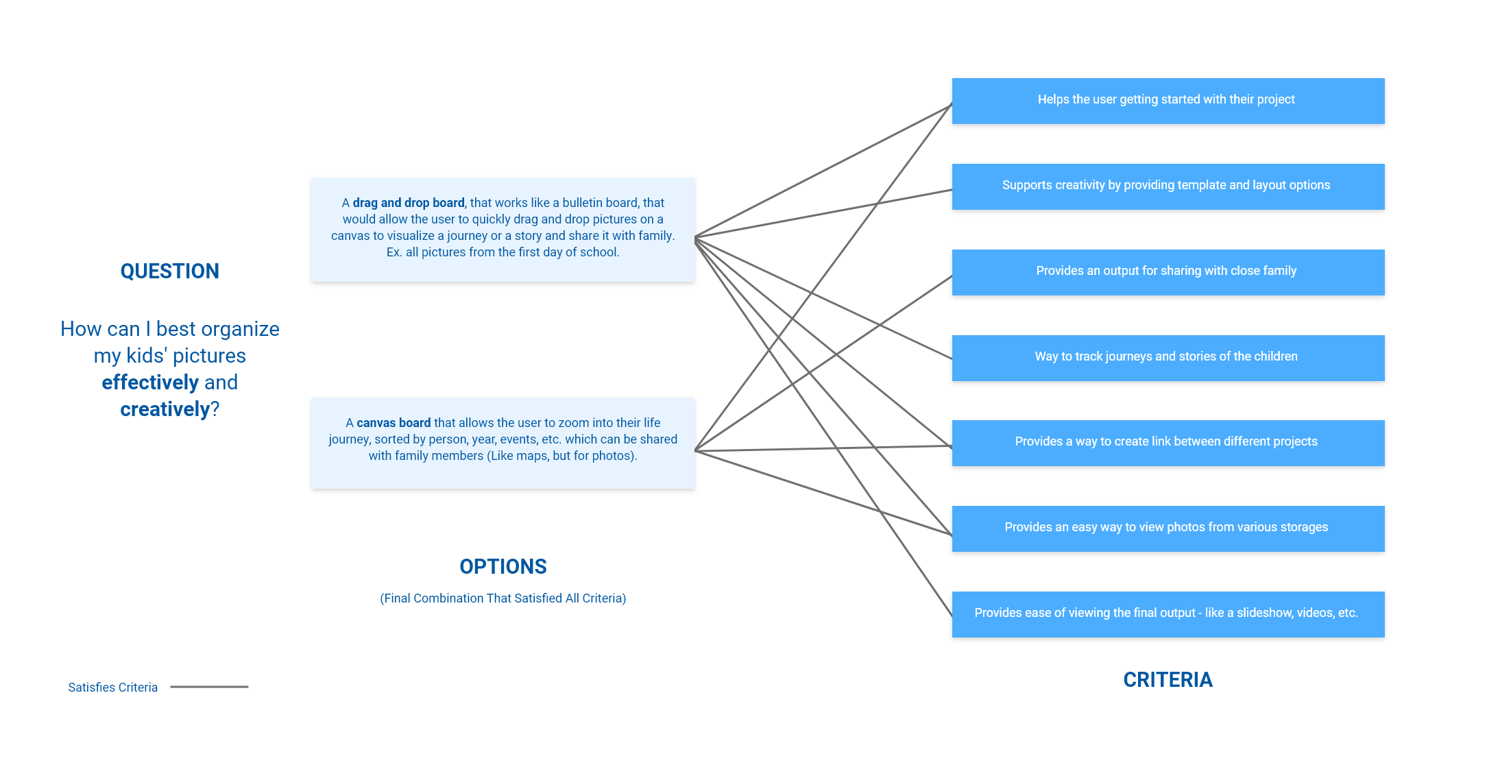
And I selected a combination of two solutions:
- A Drag and Drop Board that works like a bulletin board of photos
- A Zoom-in/out Canvas (similar to applications like Miro, Adobe Creative Suite Applications, but for photos)
The Solution: Zemory
The solution revolves around the idea of zooming in and out of memories i.e photos making 'Zemory' a great name for the platform.
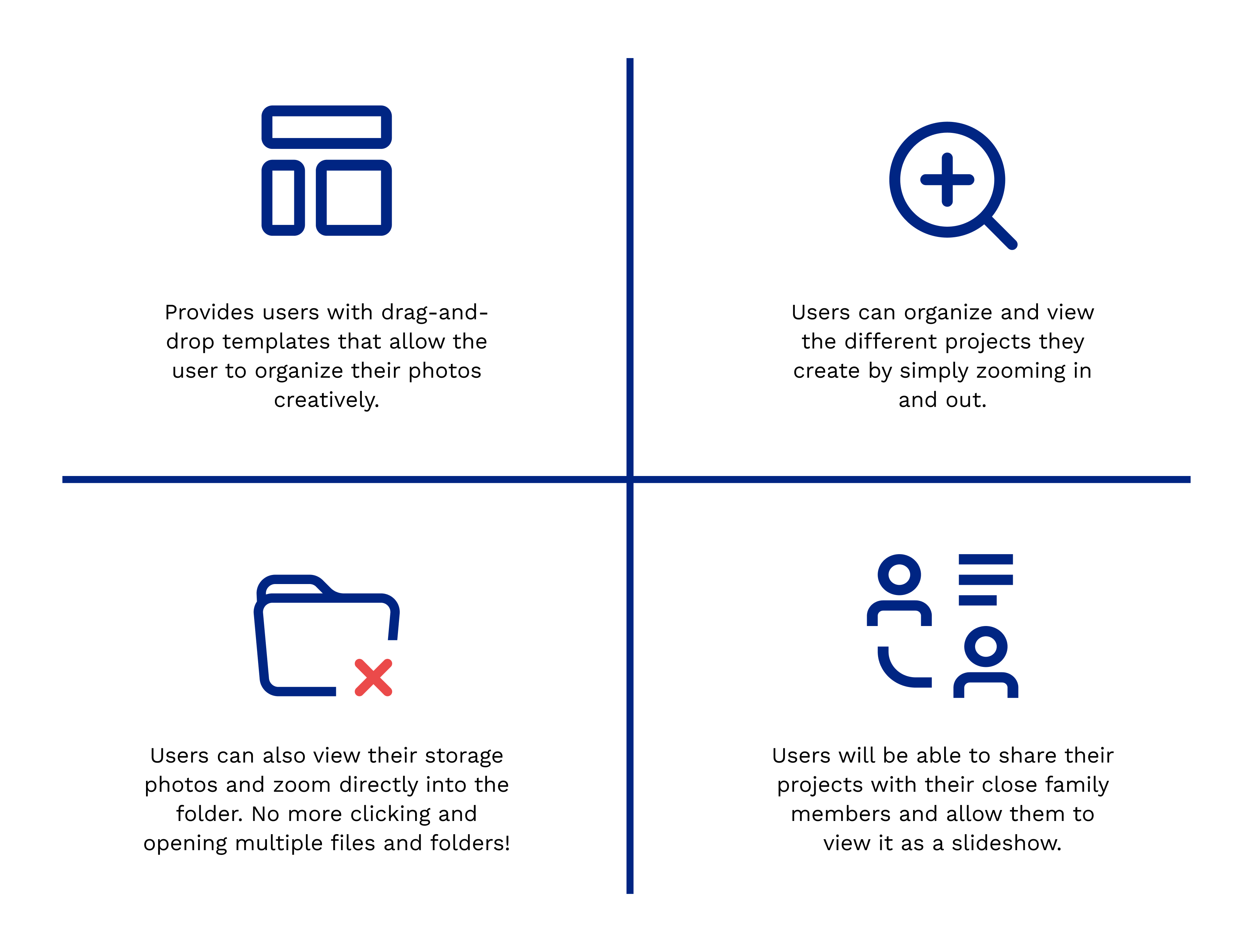
Both these solutions could be effectively implemented as a web application, thus I chose web to be the ideal platform.
Defining the Interactions using Personas and Scenarios
I created 3 detailed personas with scenarios that show detailed interaction with the platform.
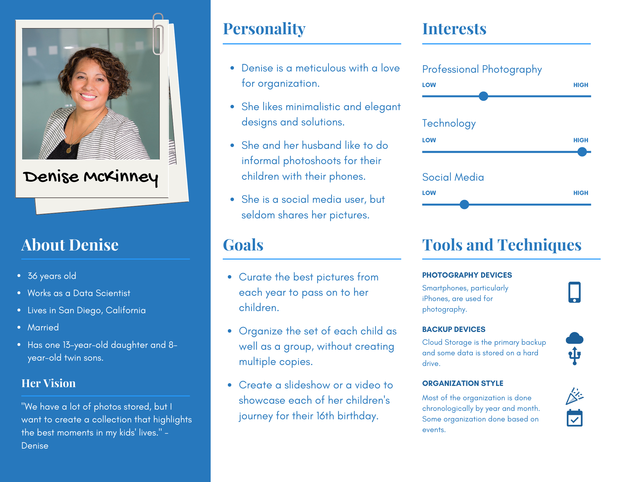
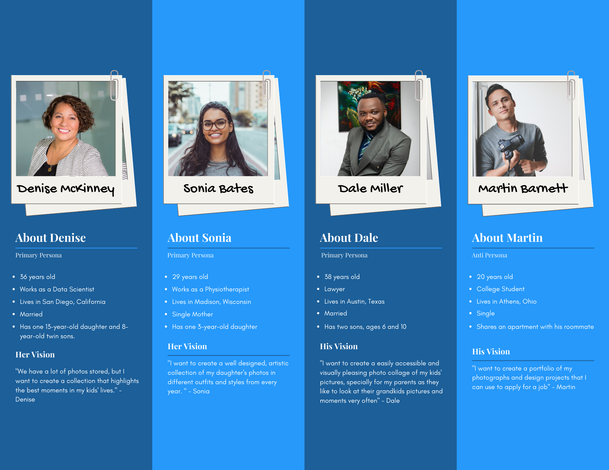
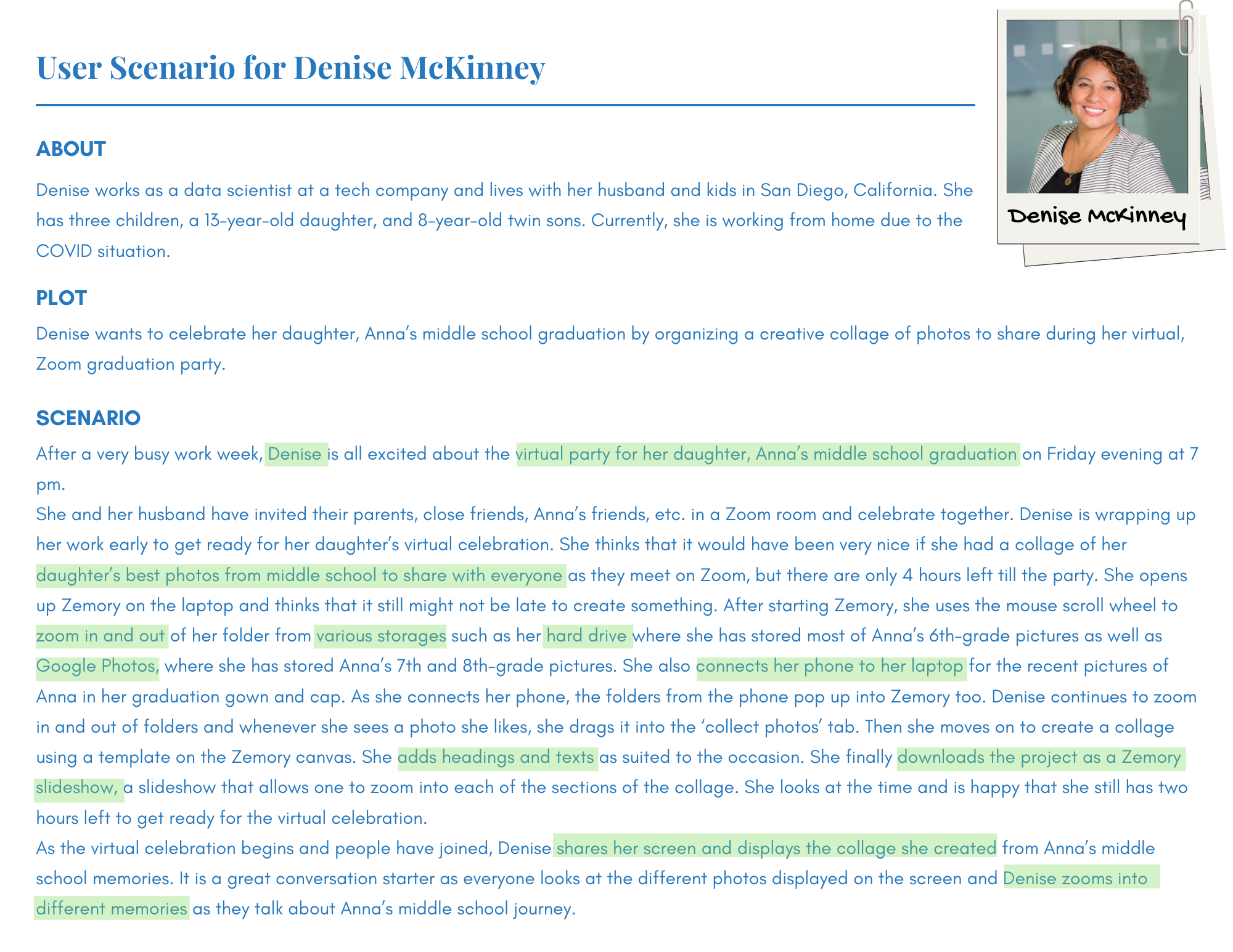
It further led me to creating the digital flow map for the platform which provided definition to the structure and interactions included in the web application.
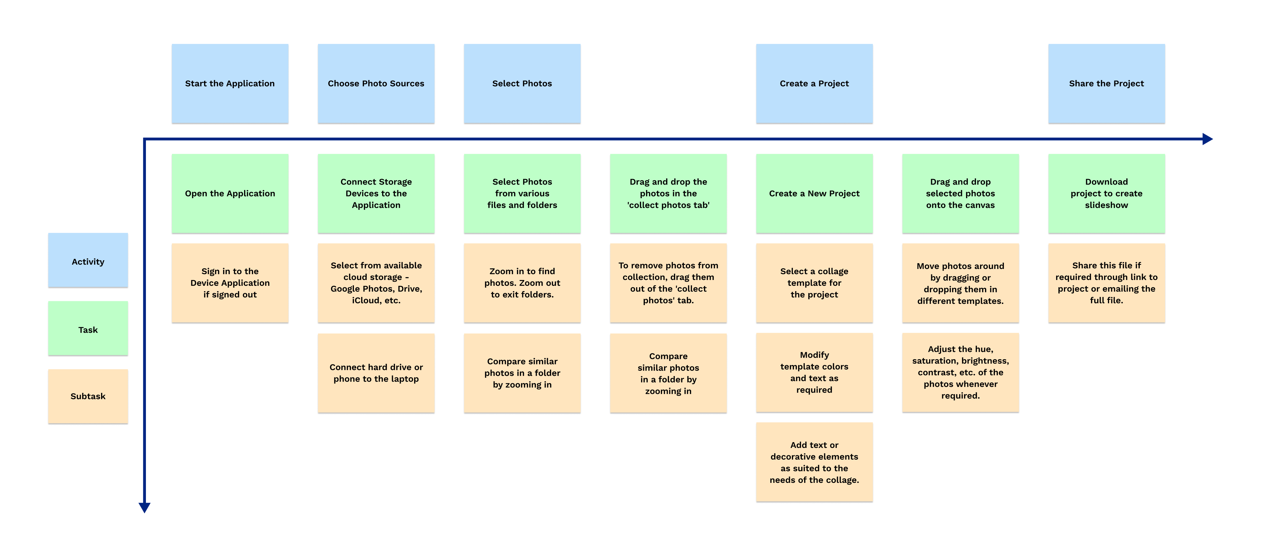
Creating the Wireframes and Low-Fidelity Prototypes
Using the increased definition of flows from the personas and user scenarios, I started with low fidelity paper prototype and a digital flow map for all the screens.
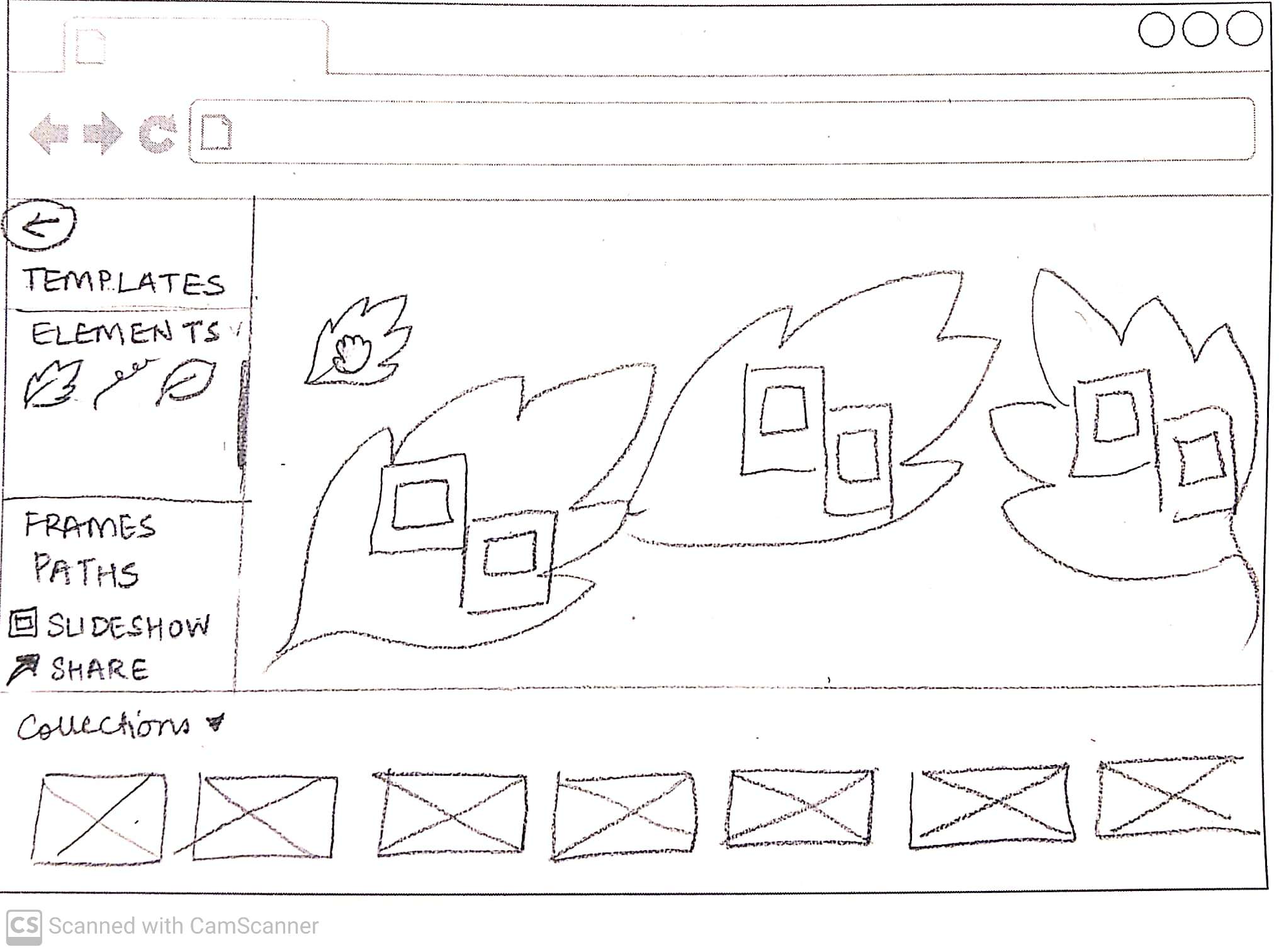
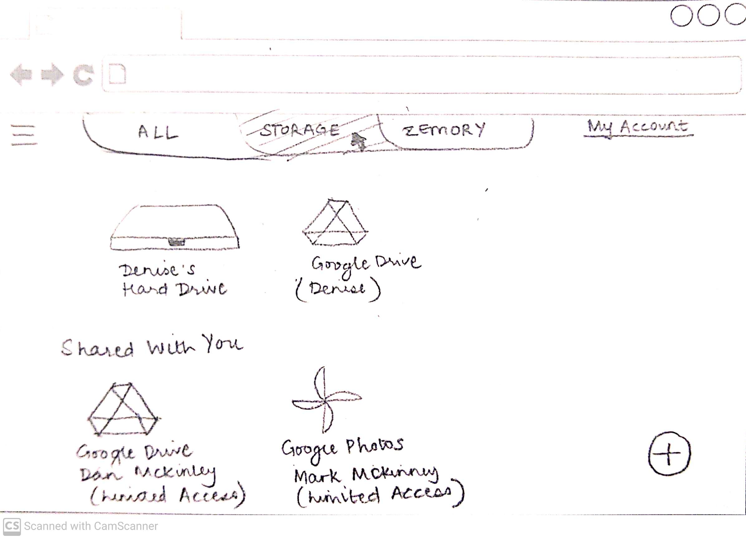
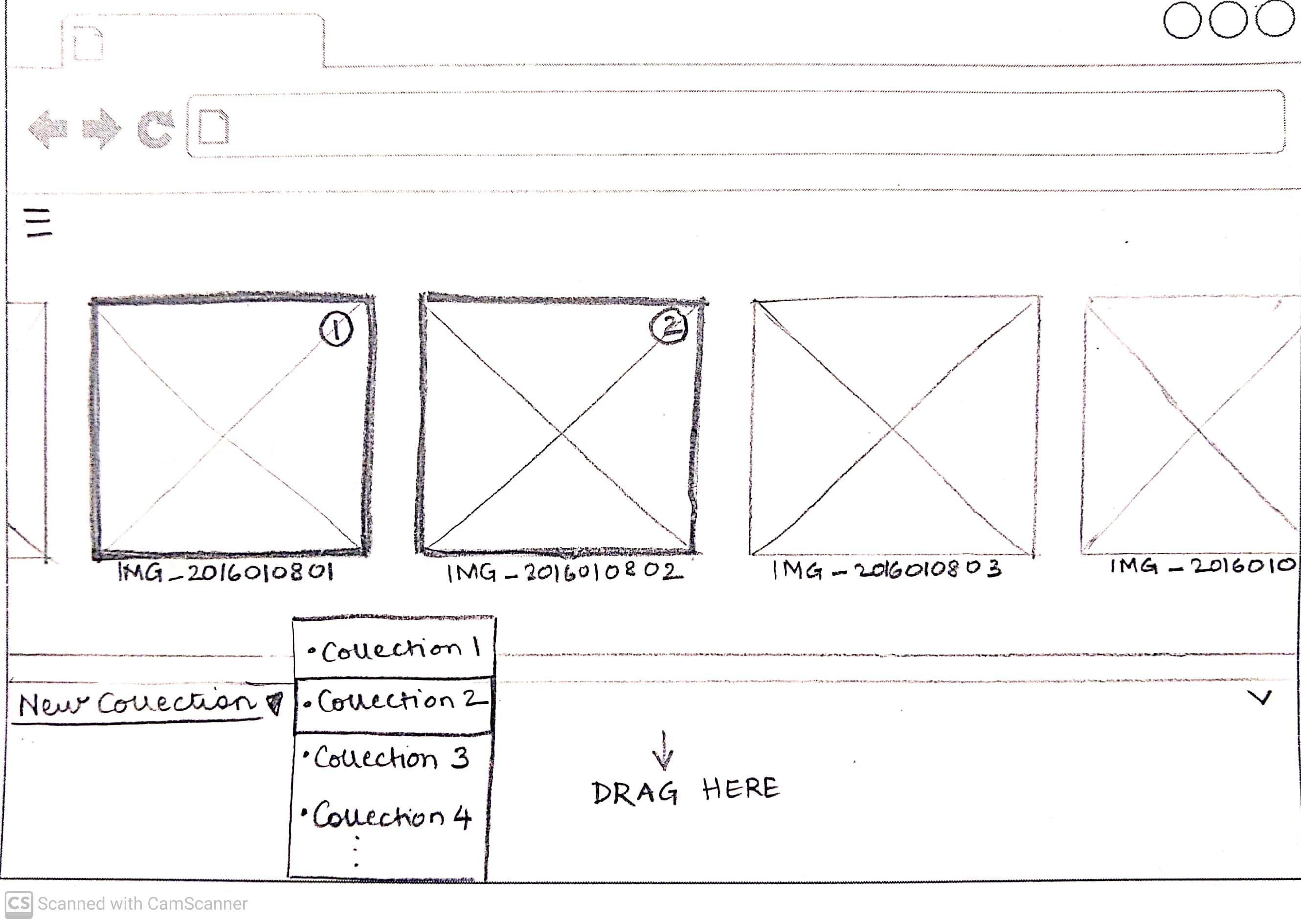

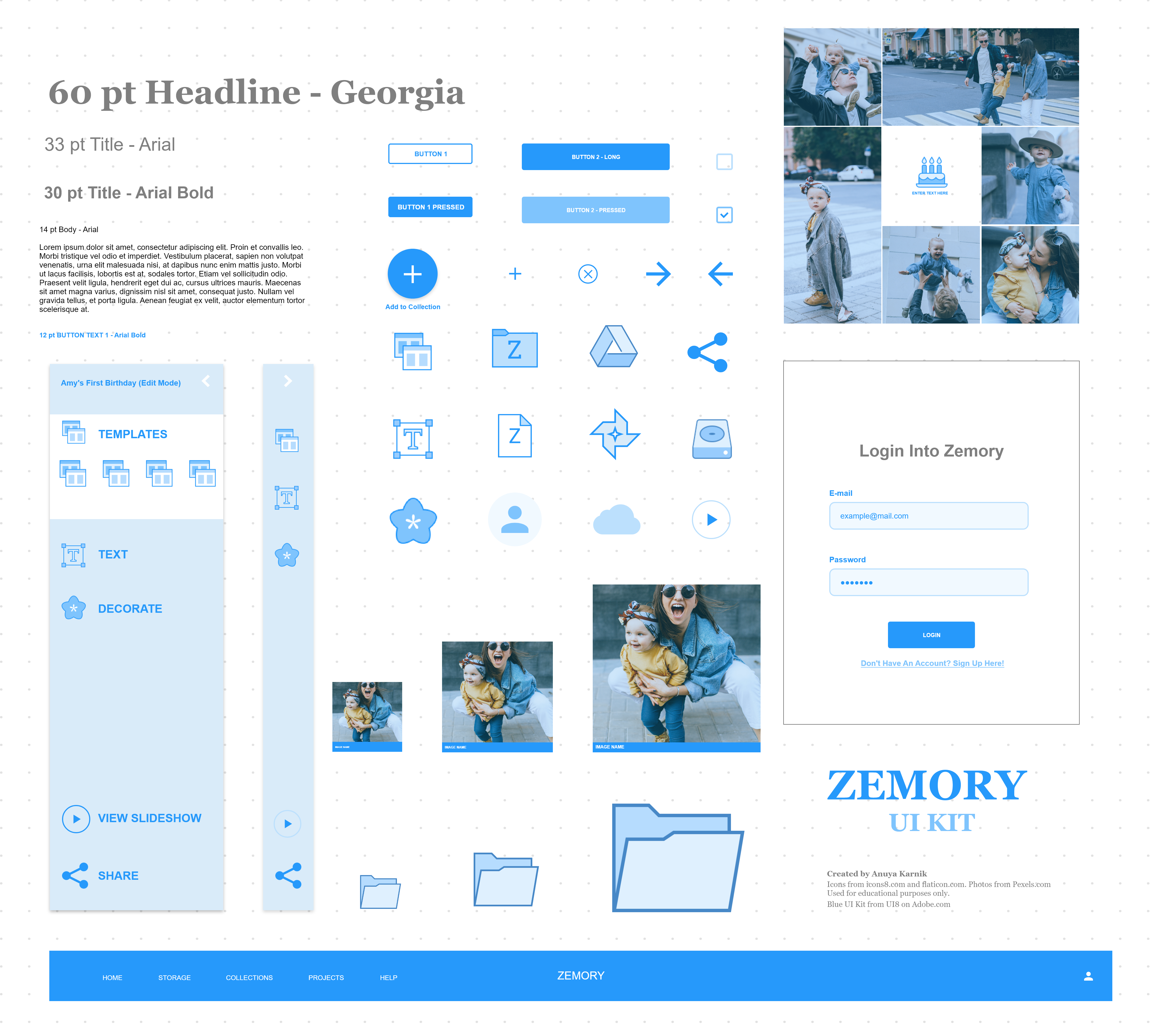
Creating a Design System
The flowmap created from the paper sketches set up the platform for being converted to a interactive prototype as well as provided all the information needed for the UI Elements needed for Zemory.
Interactive Prototype and User-Testing
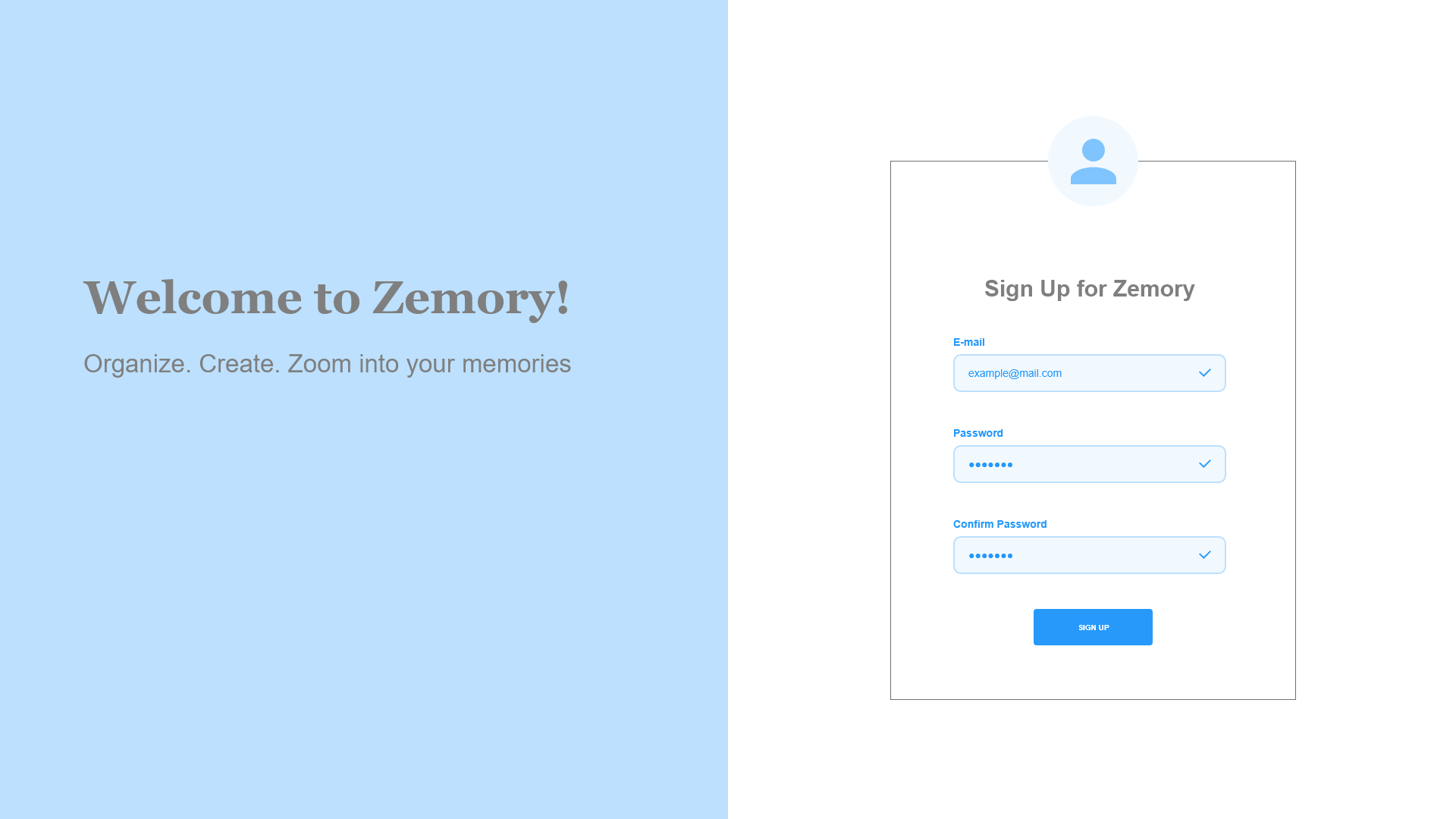
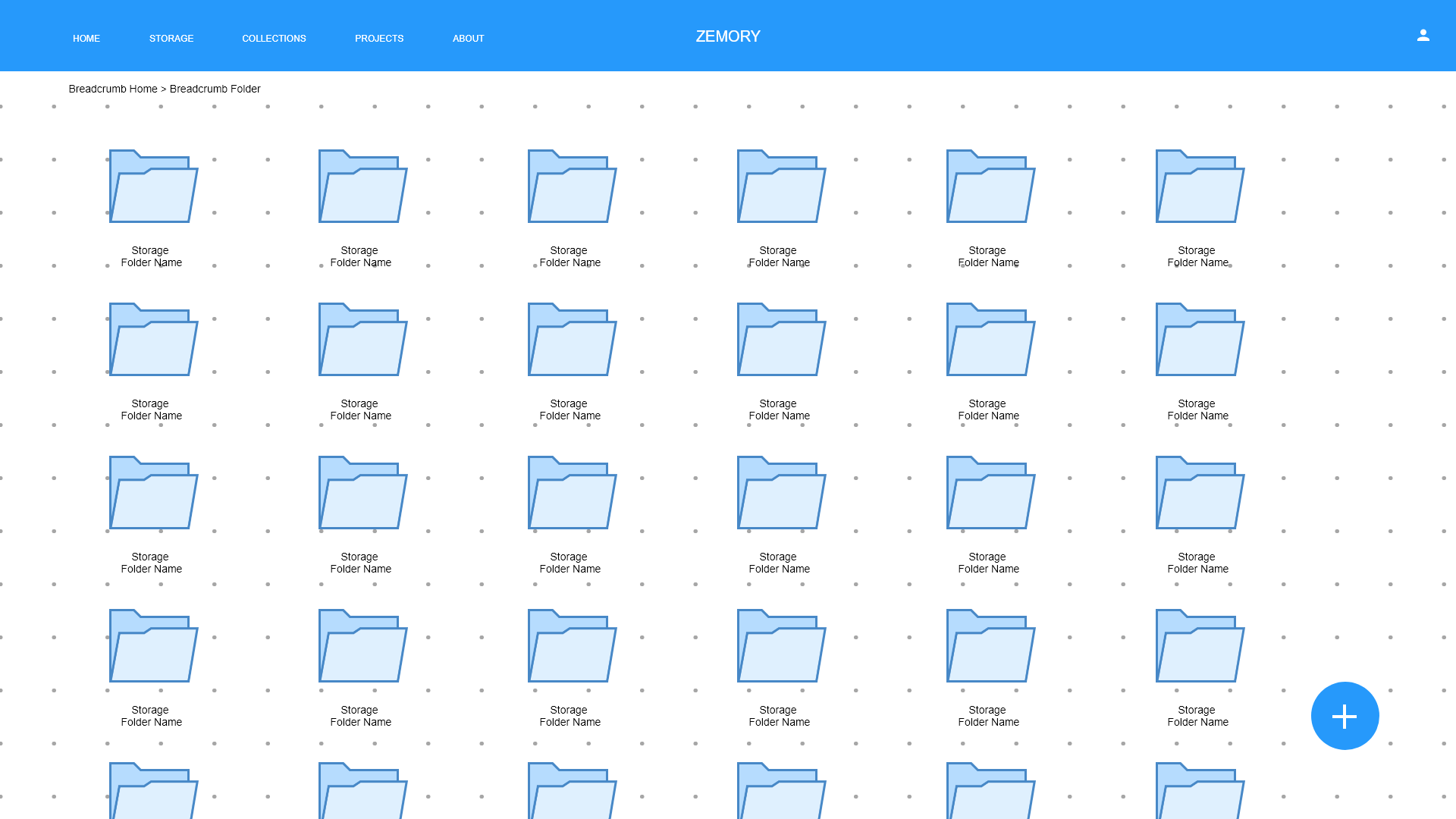
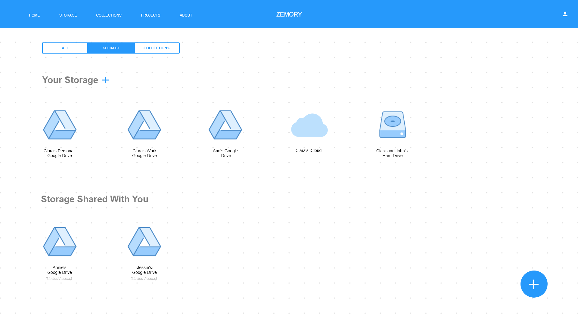
Using the wireframe and sketches, I moved on to creating a interactive prototype in Adobe XD. I used this prototype to complete a series of user tests with my classmates and detect areas where my application could be improved.

Final Interactive Prototype
This prototype ensured better flow of information, more defined components like a real photo gallery, a final slideshow etc. which have been demonstrated and explained in the video below.
Try the Final Zemory Prototype
Lessons Learned
This project taught me a lot of valuable lessons:
- I learned how important it is to lay a strong foundation of user needs, defining the problem and the objectives that need to be addressed by the solution before jumping into any Visual and UI Elements. Like they say, UX before UI!
- During the process of development, I had to go back and forth between many steps, such as creating more sketches when the I got more insights from user interviews or going back and doing more sketches when the users struggled with using the application during the user tests. This taught me that the UX research steps are flexible but it is important to be insightful while choosing the order in which they should be completed.
- I learned that being a keen observer of where users might struggle with technology is a great practice to uncover UX issues. This project started from a simple observation at home!